Voyage Western
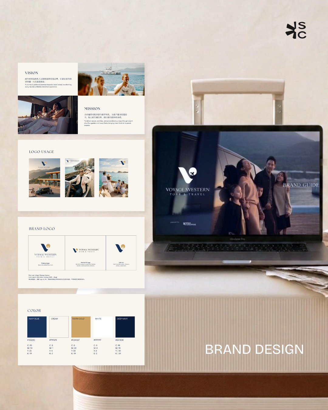
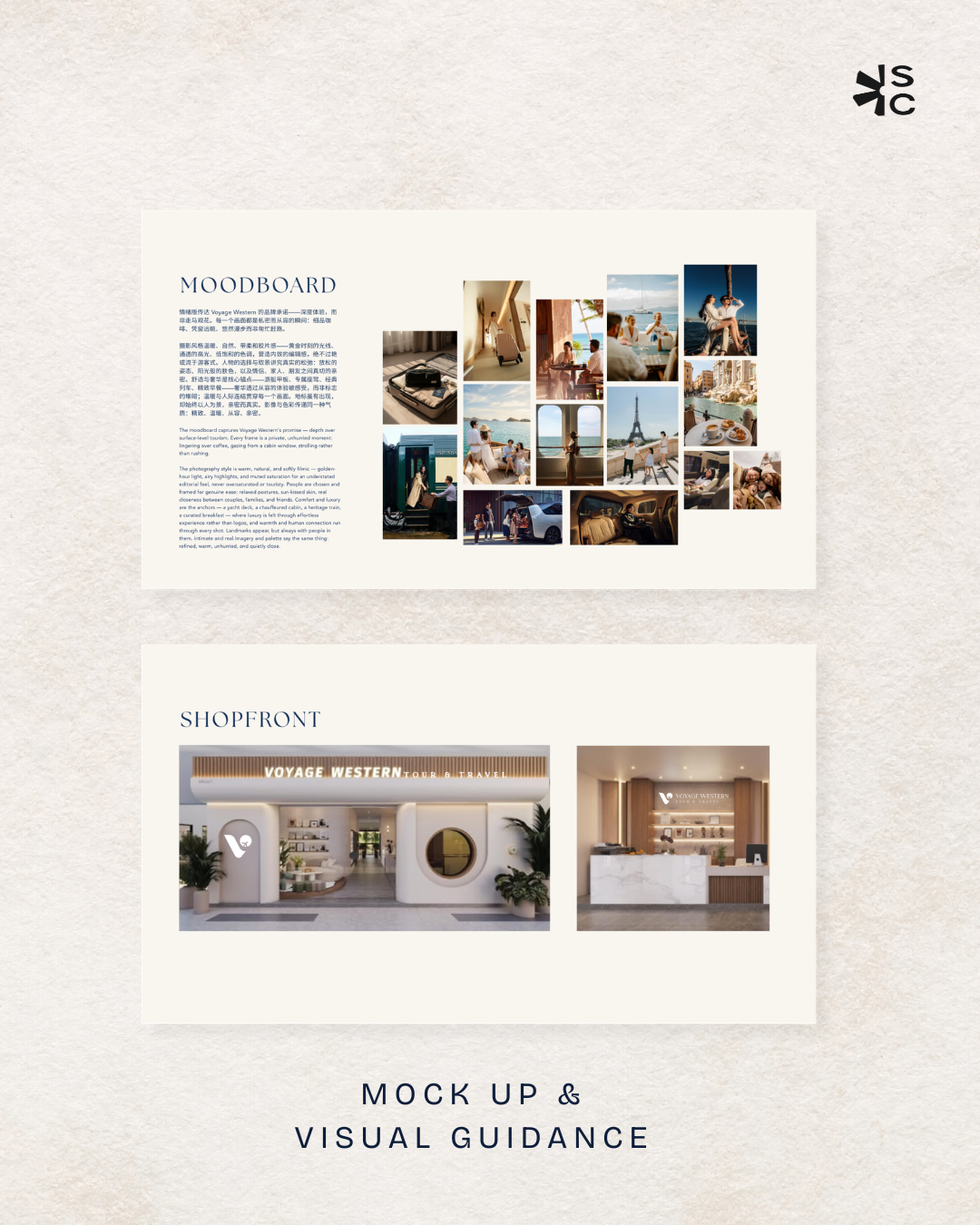
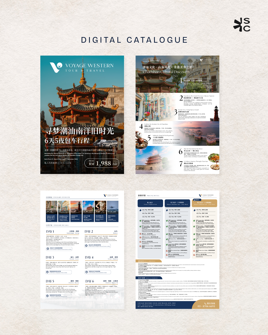
ABOUT THE PROJECT /Voyage Western had nearly eight years in the industry — but a self-made logo with no real identity behind it. Plenty of history, not enough presence. Our designer's instinct was to build the whole identity around what actually set them apart: luxury travel experiences.
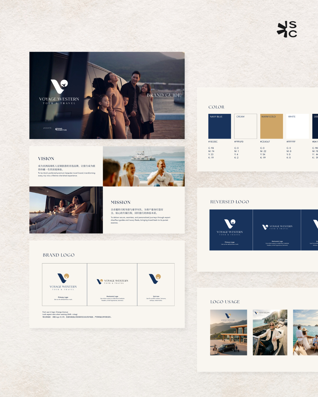
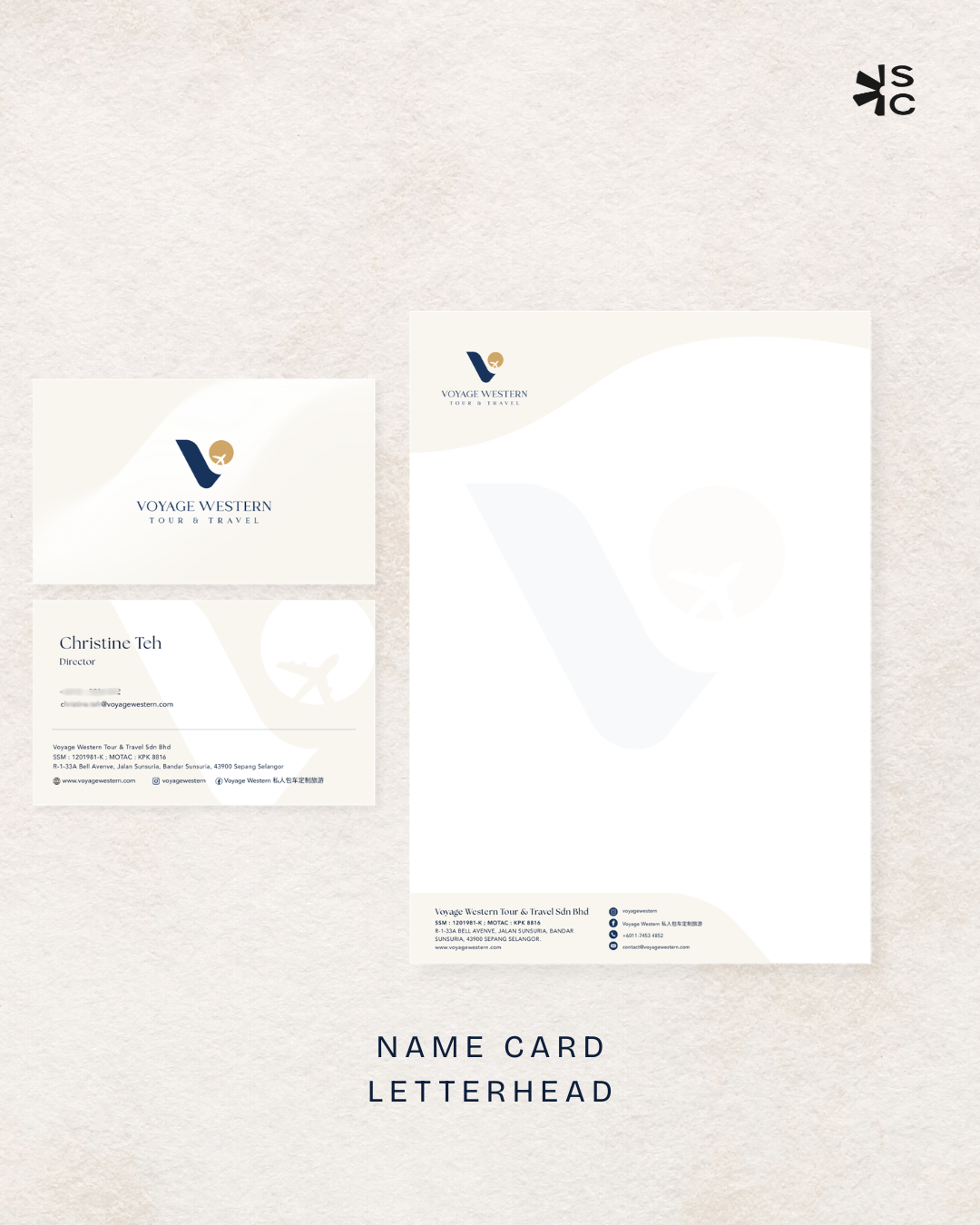
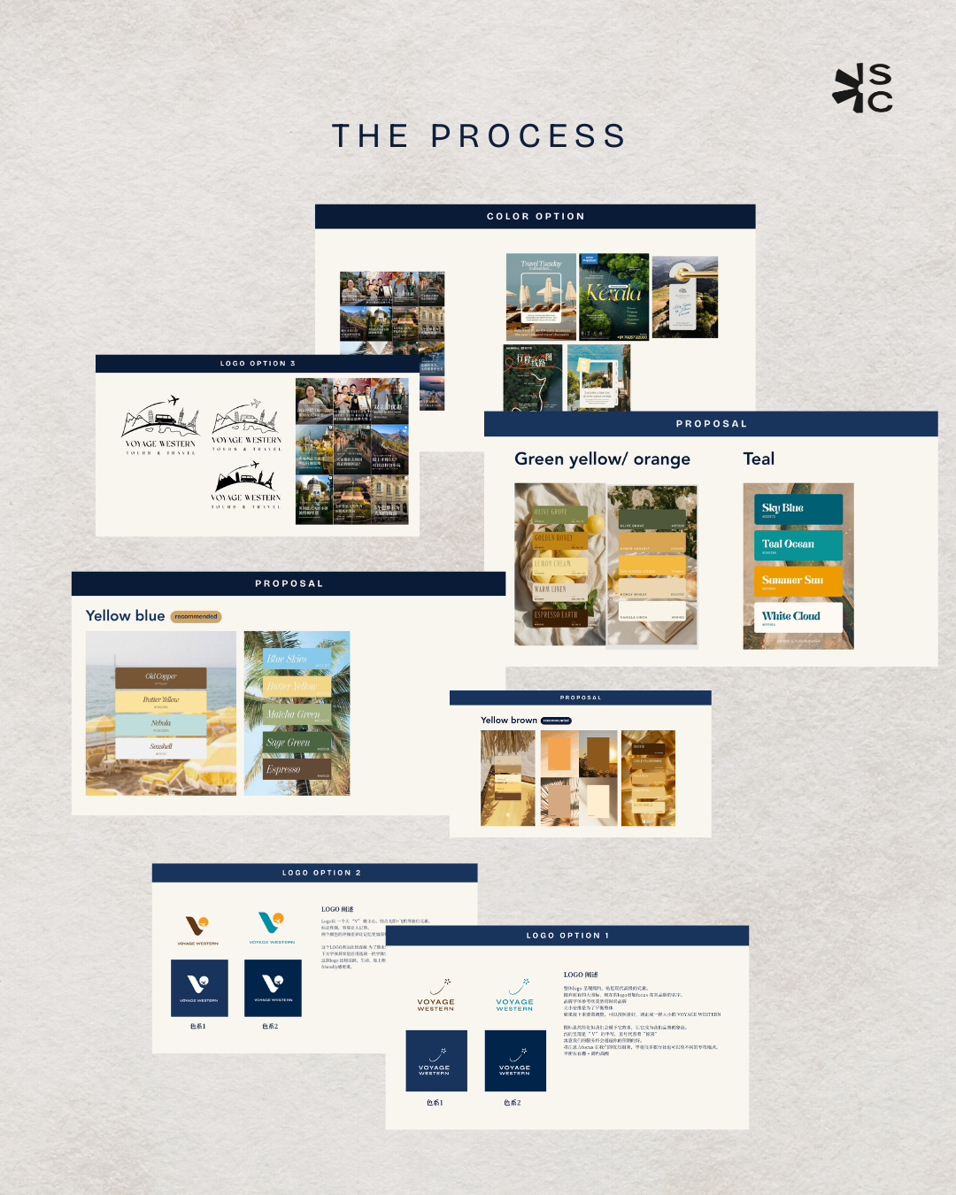
The process was collaborative from the first sketch. We proposed multiple colour directions, walked the client through the brand concept, and sketched our way toward something that felt intentional. A "V" became the trademark icon — a clean, ownable mark that carries the agency's name and signals the premium feel their service delivers.
The colours were interesting: we came in with a proposal, but the client had their own idea too — and rather than override it, our designer saw the combination working beautifully. Because good design isn't always the designer's decision alone. Sometimes the best result comes from combining and inspiring, not dictating.
The outcome: Voyage Western is no longer just another casual travel agency. It carries the personality and essence of luxury it always should have. And that's the real reason branding matters — it's not decoration, it's what makes you feel confident in your own brand.