Hengbucha
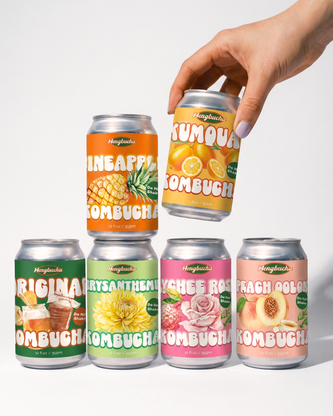
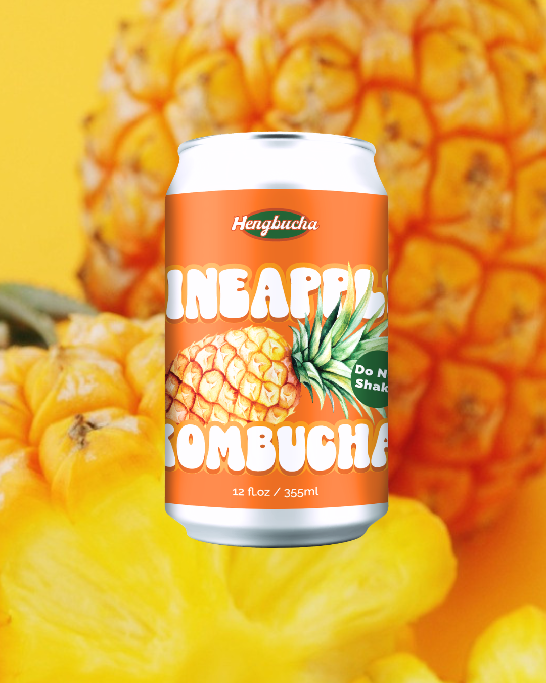
ABOUT THE PROJECT /Packaging Redesign- Hengbucha’s original packaging featured a minimal, monotone look—clean but easily overlooked on crowded shelves. As a packaging design studio, the redesign focused on improving shelf impact, brand identity, and overall visual branding.
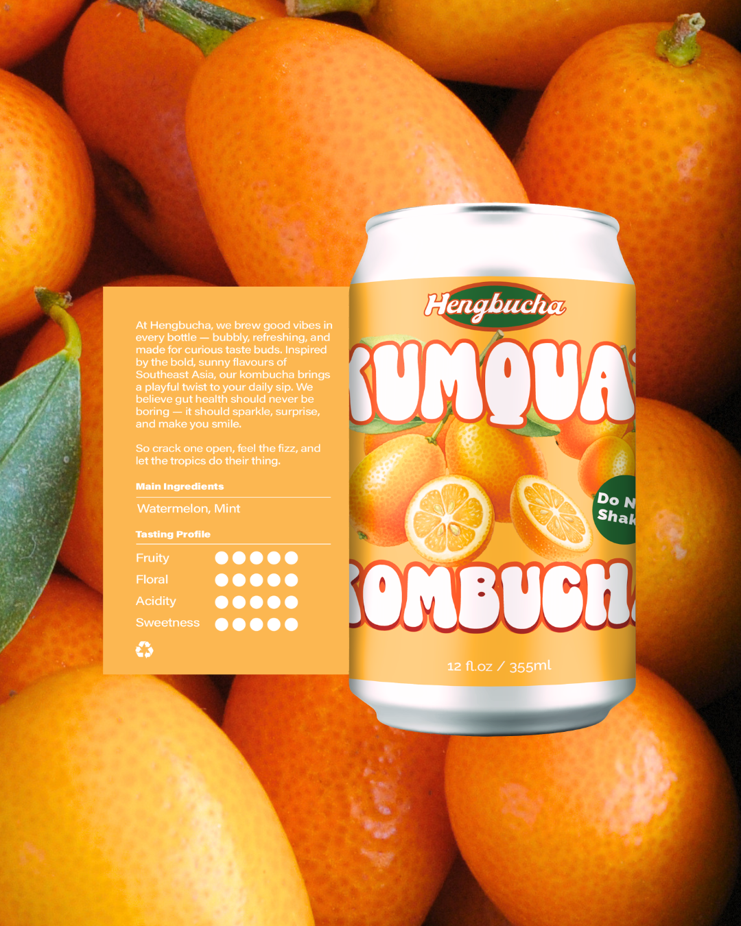
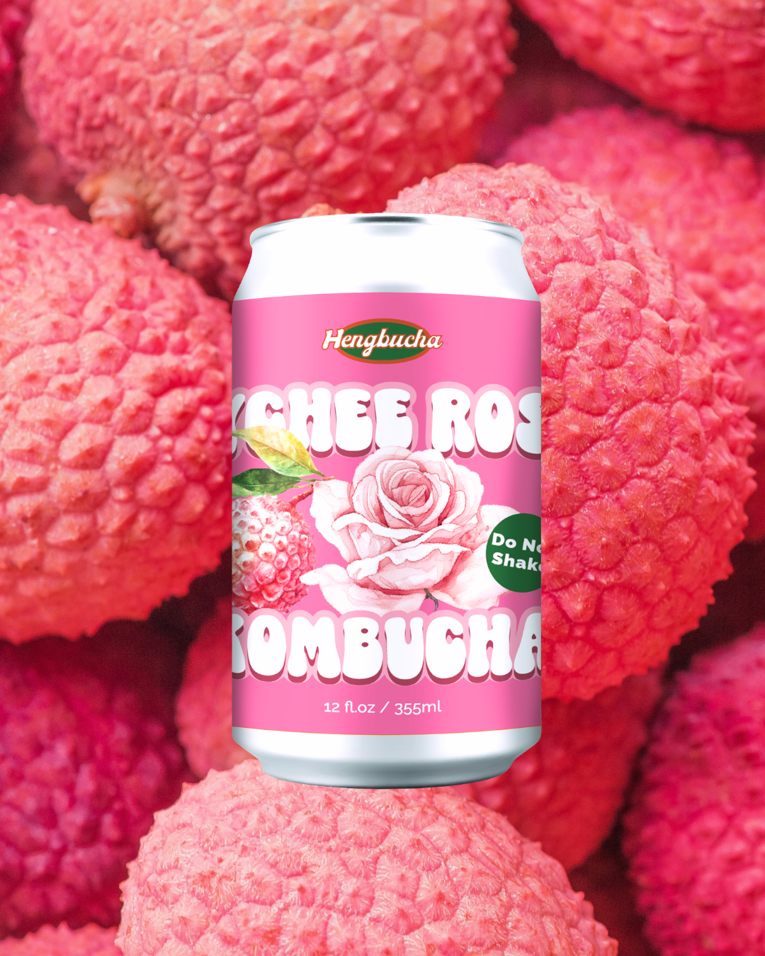
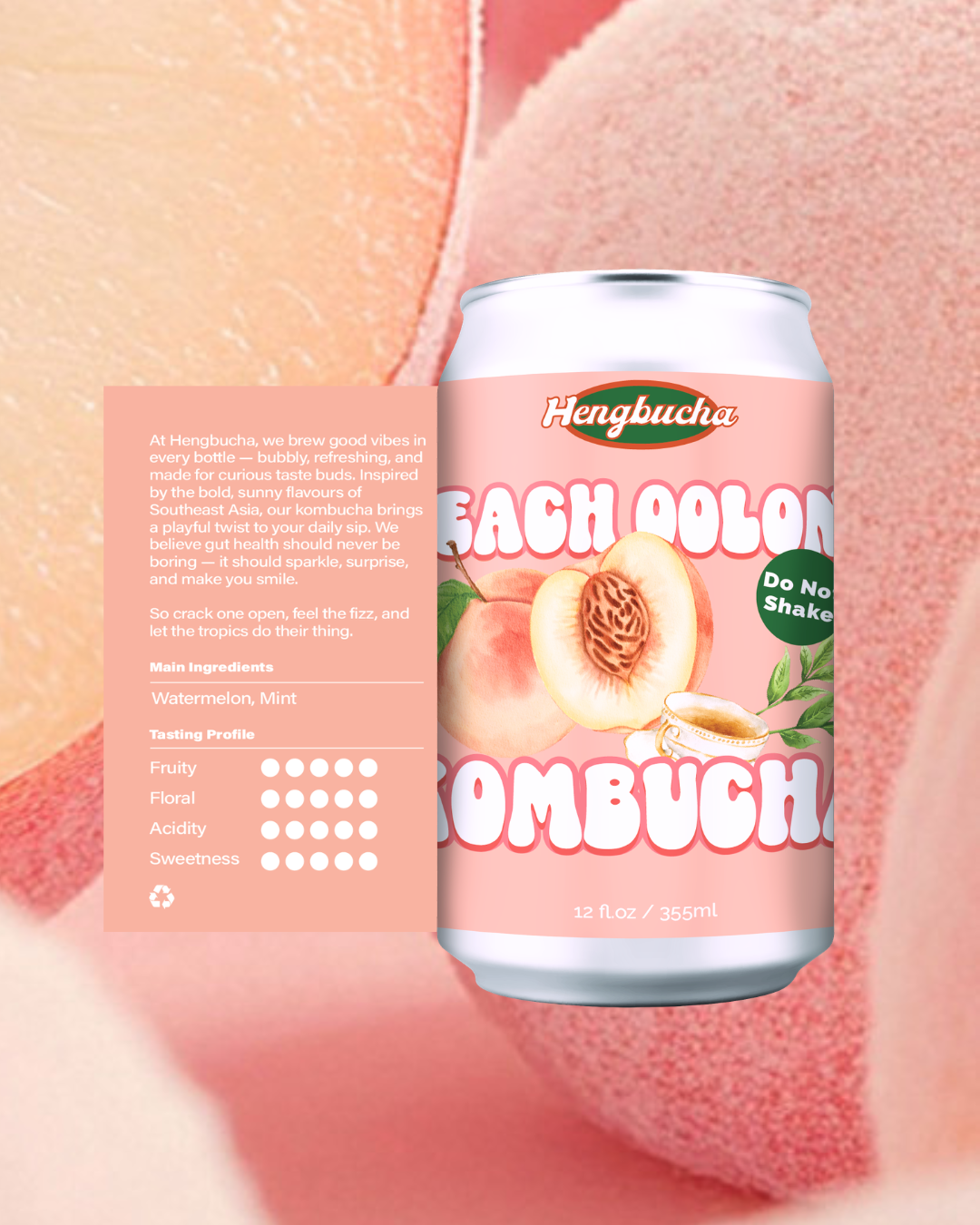
Each flavor is assigned a distinct color system to enhance recognition and create a more engaging consumer experience. This approach strengthens brand differentiation while appealing to a younger, design-conscious audience.
The result is a bold, eye-catching packaging system that stands out on the shelf and reflects a strategic, marketing-driven branding and packaging design solution.